
Get subscription: https://unacademy.com/plus/goal/TEWDQ
use my referral code for 10% additional discount: NAVCLASSES
| 18 Dec 2018 Data interpretation 1st Shift (in Hindi ) | |
| 18 Dec 2018 data interpretation 1st shift part 2 | |
| 18 Dec 2018 Data interpretation 2nd Shift | |
| 18 Dec 2018 Data interpretation 2nd Shift part 2 | |
| 19 Dec 2018 Data interpretation 1st shift | |
| 22 Dec 2018 Data interpretation 1st Shift | |
| 22 Dec 2018 Data interpretation 1st Shift part 2 |

Jan 2017
The table below embodies data on the sales revenue (rs in lakh) genrated by a publishing hourse during the years 2012-15 while selling books, magazines and journals as three categories of items. Answer questions 31–33 based in the data contained in the table
Sales Revenue( ₹ in Lakh)
|
Year Items |
2012 |
2013 |
2014 |
2015 |
|
Journals |
46 |
47 |
45 |
44 |
|
Magazines |
31 |
39 |
46 |
51 |
|
Books |
73 |
77 |
78 |
78 |
|
Total |
Q.NO: 1
If the year 2016 were to show the same growth in terms of total sales revenue as the year 2015 over the year 2014, then the revenue in the year 2016 must be approximately:
(1). ₹ 194 lakh
(2). ₹ 187 lakh
(3). ₹ 172 lakh
(4). ₹ 177 lakh
Answer: 4
In 2015, approximately what percent of total revenue come from books?
(1). 45%
(2). 55%
(3). 35%
(4). 25%
Answer: 1
Q.NO: 3
The number of years in which there was an increase in revenue from at least two categories of items, is
(1). 0
(2). 1
(3). 2
(4). 3
Answer: 3
A University professor maintains data on MCA students tabulated by performance and gender of the students. The data is kept on a computer had disk, but accidentally some of it lost because of a computer virus. Only the following could be recovered:
|
Number of MCA Students |
||||
|
Performance Gender |
Average |
Good |
Excellent |
Total |
|
Male |
10 |
|||
|
Female |
32 |
|||
|
Total |
30 |
|||
Panic buttons were pressed but to no avail. An expert committee was formed, which decided that the following facts were self evident:
(a) Half the students were either excellent or good.
(b) 40% of the students were females
(c) One-third of the male students were average
Answer questions 4-6 based on the data given above
Q.NO: 4
Approximately, what proportion of good students are male?
(1). 0
(2). 0.73
(3). 0.43
(4). 0.27
Answer: 2
Q.NO: 5
How many female students are excellent?
(1). 0
(2). 8
(3). 16
(4). 32
Answer: 1
Q.NO: 6
What proportion of female students are good?
(1). 0
(2). 0.25
(3). 0.50
(4). 0.75
Answer: 2
August 2016
Consider the following two tables (I and II) that show the percentage of students in each faculty at University and the number of foreign students in the Science faculty. These percentages have been rounded to the nearest whole number. There are a total of 1049 students in the science faculty. Study these tables I and II and answer the questions that follow:

- Approximately, what percentage of students in the Science faculty is that of foreign students?
(A) 14%
(B) 9%
(C) 30%
(D) 11%
Answer – (D)
- Approximately, how many students belong to the Engineering faculty?
(A) 420
(B) 410
(C) 390
(D) 400
Answer – (B)
- In case, there are 34 European medicalstudents, then approximately, what is their percentage in the medicine faculty?
(A) 13%
(B) 18%
(C) 12%
(D) 15%
Answer – (D)
A college has a total of 800 MCA students, 80% of whom are in class MCA-III and remaining are equally divided between class MCA-I and class MCA-II. The proportion of female students and the proportion of vegetarian students in the college are indicated as under through the table. Answer questions 4 to 6 based on this information.
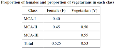
For example, in the table above, 0.525 is the total proportion of female students and 0.53 is the total proportion of vegetarian students in the college.
- What is the percentage of female students in class MCA-III ?
(A) 40
(B) 45
(C) 50
(D) 55
Answer – (D)
(A) 40
(B) 45
(C) 50
(D) 55
Answer – (A)
Total Students = 800.
No. of students in MCA III = 80% of 800 = 640.
Rest Students = 800 – 640 = 160.
Rest students are divided equally into class MCA I & MCA II. So,
No. of students in class 12 = 160/2 = 80.
Now, total vegetarian = 53%
No. of Total vegetarian = 53% of 800 = 424.
55% of MCA III students are vegetarian.
No. of vegetarian in MCA III = 55% of 640 = 352.
No. vegetarian in MCA II = 50% of 80 = 40
Thus, no. of vegetarian in MCA I,
= 424– 352 – 40 = 32.
Thus,
In class MCA I total vegetarian = 32.
So, % of vegetarian = (32/800) * 100 = 40%.
- How many total non–vegetarian students are there in class MCA-I and class MCA-II?
(A) 72
(B) 88
(C) 78
(D)92
Answer – (B)
July 2016
The following table shows the percentage profit (%) earned by two companies A and B during the years 2011-15. Answer questions 1 to 3 based on the data contained in the table:
|
Year |
Percentage Profit (%) |
|
|
A |
B |
|
|
2011 |
20 |
30 |
|
2012 |
35 |
40 |
|
2013 |
45 |
35 |
|
2014 |
40 |
50 |
|
2015 |
25 |
|
Where, percent (%) Profit = (Income-Expenditure) × 100/Expenditure
- If the total expenditure of the two companies was Rs.9 lakh in the year 2012 and the expenditure of A and B were in the ratio2:1, then what was the income of the company A in that year?
(A) Rs.9.2 lakh
(B) Rs.8.1 lakh
(C) Rs.7.2 lakh
(D) Rs.6.0 lakh
Answer B
- What is the average percentage profit earned by the company B?
(A) 35%
(B) 42%
(C) 38%
(D) 40%
Answer C
(A) 2012
(B) 2013
(C) 2014
(D) 2015
Answer B
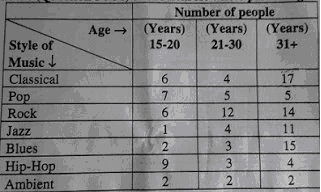
The following table shows the number of people in different age groups who responded to a survey about their favourite style of music. Use this information to answer the questions that follow: (Question 4 to 6) to the nearest whole percentage:
(A) 31%
(B) 23%
(C) 25%
(D) 14%
Answer C
- Approximately what percentage of the total sample indicates that Hip-Hop is their favourite style ofmusic?
(A) 6%
(B) 8%
(C) 14%
(D) 12%
Answer D
(A) 64%
(B) 60%
(C) 75%
(D) 50%
Answer C
December 2015
Given below in the table is the decadal data of Population and Electrical Power Production of a country.
|
Year |
Population (million) |
Electrical Power Production (GW)* |
|
1951 |
20 |
10 |
|
1961 |
21 |
20 |
|
1971 |
24 |
25 |
|
1981 |
27 |
40 |
|
1991 |
30 |
50 |
|
2001 |
32 |
80 |
|
2011 |
35 |
100 |
|
* 1 GW = 1000 million watt |
Based on the above table, answer the following questions:
- Which decade registered the maximum growth rate (%) of population?
(A) 1961-71
(B) 1971-81
(B) 1991-2001
(D) 2001-2011
Answer A
- Average decadal growth rate (%) of population is:
(A) ~12.21%
(B) ~9.82%
(D) ~5%
Answer B
(A) 40.34 million
(B) 38.49 million
(C) 37.28 million
(D) 36.62 million
Answer B
(A) 100 W
(B) 200 W
(C) 400 W
(D) 500 W
Answer D
- In which decade, the average power availability per person was maximum?
(A) 1981-1991
(B) 1991-2001
(C) 2001-2011
(D) 1971-1981
Answer C
- By what percentage(%)the power production increased from 1951 o 2011?
(A) 100%
(B) 300%
(C) 600%
(D) 900%
Answer D
June 2015
Question numbers 1 to 6 are based on the tabulated data given below:
:
A Company has 20 employees with their ages (in years)and salary (in thousand rupees per month) mentioned against each of them :

- Classify the data of age of each employee in class interval of 5 years. Which class interval of 5 years has the maximum average salary
(A) 35 – 40 years
(B) 40 – 45 years
(C) 45 – 50 years
(D) 50 – 55 years
Answer D
(A) 20 PERC
(B) 25 PERC
(C) 30 PERC
(D) 35 PERC
Answer B
- What is the average age of the employees
(A) 40.3 years
(B) 38.6 years
(C) 47.2 years
(D) 45.3 years
Answer A
- What is the fraction (PERC) of employees getting salary >= 40,000 per monthage salary
(A) 45 PERC
(B) 50 PERC
(C) 35 PERC
(D) 32 PERC
Answer A
(A) 35
(B) 42.5
(C) 40.5
(D) 36.5
Answer B
(A) 45 PERC
(B) 50 PERC
(C) 55 PERC
(D) 47 PERC
Answer C
December 2014
For a county, CO2 emissions (million metric tons) from various sectors are given in the following table. Answer the questions based on the data given:
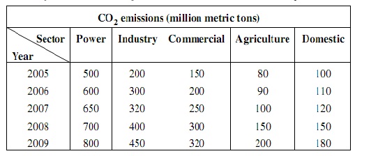
(A) ~89.32%
(B) ~57.62%
(C) ~40.32%
(D) ~113.12%
Answer A
(A) ~12.57%
(B) ~16.87%
(C) ~30.81%
(D) ~50.25%
Answer A
(A) ~30.82%
(B) ~41.18%
(C) ~51.38%
(D) ~60.25%
Answer B
(A) 2005
(B) 2006
(C) 2007
(D) 2008
Answer A
- What is the percentage (%) growth of CO2emission from power sector during 2005 to 2009?
(A) 60
(B) 50
(C) 40
(D) 80
Answer A
(A) Power
(B) Industry
(C) Commercial
(D) Agriculture
Answer D
June 2014
Read the following table and answer question based on table:
|
Year |
Government Canals |
Private Canals |
Tanks |
Tube wells and other wells |
Other sources |
Total |
|
1997-98 |
17117 |
211 |
2593 |
32090 |
3102 |
55173 |
|
1998-99 |
17093 |
212 |
2792 |
33988 |
3326 |
57411 |
|
1999-00 |
16842 |
194 |
2535 |
34623 |
2915 |
57109 |
|
2000-01 |
15748 |
203 |
2449 |
33796 |
2880 |
55076 |
|
2001-02 |
15031 |
209 |
2179 |
34906 |
4347 |
56672 |
|
2002-03 |
13863 |
206 |
1802 |
34250 |
3657 |
53778 |
|
2003-04 |
14444 |
206 |
1908 |
35779 |
4281 |
56618 |
|
2004-05 |
14696 |
206 |
1727 |
34785 |
7453 |
58867 |
|
2005-06 |
15268 |
207 |
2034 |
7314 |
60196 |
- Which of the following sources of Irrigation has registered the largest percentage of decline in Net area under irrigation during 1997-98 and 2005-06 ?
(A) Government Canals
(B) Private Canals
(C) Tanks
(D) Other Sources
Answer C
- Find out the source of irrigation that has registered the maximum improvement in terms of percentage of Net irrigated area during 2002-03 and 2003-04.
(A) Government Canals
(B) Tanks
(C) Tube Wells and other wells
(D) Other Sources
Answer D
(A) 1998-99
(B) 2000-01
(C) 2003-04
(D) 2005-06
Answer D
- Identify the source of irrigation that has recorded the maximum incidence of negative growth in terms of Net irrigated area during the years given in the table.
(A) Government Canals
(B) Private Canals
(C) Tube Wells and other wells
(D) Other sources
Answer A
- In which of the following years, share of the tube wells and other wells in the total net irrigated area was the highest?
(A) 1998–99
(B) 2000-01
(C) 2002-03
(D) 2004-05
Answer C
December 2013
Following table provides details about the Foreign Tourist Arrivals (FTAs) in India from different regions of the’ world in different years. Study the table carefully and answer the questions based on this table.
|
Region |
Number of Foreign Tourist Arrival |
||
|
2007 |
2008 |
2009 |
|
|
Western Europe |
1686083 |
1799525 |
1610086 |
|
North America |
1007276 |
1027297 |
1024469 |
|
South Asia |
982428 |
1051846 |
982633 |
|
South East Asia |
303475 |
332925 |
348495 |
|
East Asia |
352037 |
355230 |
318292 |
|
West Asia |
171661 |
215542 |
201110 |
|
Total FTAs in India |
5081504 |
5282603 |
5108579 |
- Find out the region that contributed around 20 percent of the total foreign tourist arrivals in India in 2009.
(A) Western Europe
(B) North America
(C) South Asia
(D) South East Asia
Answer B
- Which of the following regions has recorded the highest negative growth rate of foreign tourist arrivals in India in 2009?
(A) Western Europe
(B) North America
(C) South Asia
(D) West Asia
(A) Western Europe 10.5%
(B) North America 2.7%
(C) South Asia 6.5%
(D) West Asia 6.69%
Answer – should be A (10.5%)
(D) as per official ans key (wrong)
- Find out the region that has been showing declining trend in terms of share of foreign tourist arrivals in India in 2008 and2009.
(A) Western Europe
(B) South East Asia
(C) East Asia
(D) West Asia
Answer D
- Identify the region that has shown hyper growth rate of foreign tourist arrivals than the growth rate of the total FTAs in India in 2008.
(A) Western Europe
(B) North America
(C) South Asia
(D) East Asia
Answer C
September 2013
In the following table, trends in production of energy in India by primary sources are given. Study the table and answer the following questions: (Production in peta Joules)
|
Year |
Coal & Lignite |
Crude Petroleum |
Natural Gas |
Electricity (Hydro & Nuclear) |
Total |
|
2006-07 |
7459 |
1423 |
1223 |
4763 |
14,868 |
|
2007-08 |
7926 |
1429 |
1248 |
4944 |
15,547 |
|
2008-09 |
8476 |
1403 |
1265 |
5133 |
16,277 |
|
2009-10 |
9137 |
1411 |
1830 |
4511 |
16,889 |
|
2010-11 |
9207 |
1579 |
2012 |
5059 |
17,857 |
(A) 2007–08
(B) 2008–09
(C) 2009–10
(D) 2010–11
Answer C
(A) Coal & lignite
(B) Crude petroleum
(C) Hydro & nuclear electricity
(D) Total production of energy
Answer A
- Which one of the following primary sources of energy has recorded the highest growth in production in 2008–09?
(A) Coal & lignite
(B) Crude petroleum
(C) Natural gas
(D) Hydro & nuclear electricity
Answer A
- In which year, production of hydro and nuclear electricity was almost double the production of crude petroleum and natural gas taken together?
(A) 2006–07
(B) 2007–08
(C) 2008–09
(D) 2009–10
Answer C
June 2013
Read the table below and based on this table answer the following questions:
Area under Major Horticulture Crops (in lakh hectares)
|
Year |
Fruits |
Vegetables |
Flowers |
Total Horticulture Area |
|
2005-06 |
53 |
72 |
1 |
187 |
|
2006-07 |
56 |
75 |
1 |
194 |
|
2007-08 |
58 |
78 |
2 |
202 |
|
2008-09 |
61 |
79 |
2 |
207 |
|
2009-10 |
63 |
79 |
2 |
209 |
- Which of the following two years have recorded the highest rate of increase in area under the total horticulture?
(A) 2005-06 & 2006-07
(B) 2006-07 & 2008-09
(C) 2007-08 & 2008-09
(D) 2006-07 & 2007-08
Answer D
- Shares of the area under flowers, vegetables and fruits in the area under total horticulture are respectively:
(A) 1, 38 and 30 percent
(B) 30, 38 and 1 perctent
(C) 38, 30 and 1 percent
(D) 35, 36 and 2 percent
Answer A
- Which of the following has recorded the highest rate of increase in area during 2005-06 to 2009-10?
(A) Fruits
(B) Vegetables
(C) Flowers
(D) Total horticulture
Answer C
- Find out the horticultural crops that have recorded an increase of area by around 10 percent from 2005-06 to 2009-10.
(A) Fruits
(B)Vegetables
(C) Flower
(D)Total horticulture
Answer B
- What has been the share of area under fruits, vegetables and flowers in the area under total horticulture in 2007-08?
(A) 53 percent
(B) 68 percent
(C) 79 percent
(D) 100 percent
Answer B
- In which year, area under fruits has recorded the highest rate of increase?
(A) 2006-07
(B) 2007-08
(C) 2008-09
(D) 2009-10
Answer A
December 2012
On the basis of the data given in the following table, give answers to questions:
Government Expenditures on Social Services
(As percent of total expenditure)
|
Sl. No. |
Items |
2007–08 |
2008-09 |
2009-10 |
2010-11 |
|
Social Services |
11.06 |
12.94 |
13.06 |
14.02 |
|
|
(a) |
Education, sports & youth affairs |
4.02 |
4.04 |
3.96 |
4.46 |
|
(b) |
Health & family welfare |
2.05 |
1.91 |
1.90 |
2.03
|
|
(c) |
Water supply, housing, etc. |
2.02 |
2.31 |
2.20 |
2.27 |
|
(d) |
Information & broadcasting |
0.22 |
0.22 |
0.20 |
0.22 |
|
(e) |
Welfare to SC/ST & OBC |
0.36 |
0.35 |
0.41 |
0.63 |
|
(f) |
Labour and employment |
0.27 |
0.27 |
0.22 |
0.25 |
|
(g) |
Social welfare & nutrition |
0.82 |
0.72 |
0.79 |
1.06 |
|
(h) |
North-eastern areas |
0.00 |
1.56 |
1.50 |
1.75 |
|
(i) |
Other social services |
1.29 |
1.55 |
1.87 |
1.34 |
|
Total Government expenditure |
100.00 |
100.00 |
100.00 |
100.00 |
5 percent of the total expenditures incurred on the social services in 2008–09?
(A) One
(B) Three
(C) Five
(D) All the above
Answer D
(A) 2007-08
(B) 2008–09
(C) 2009-10
(D) 2010-11
Answer B
- Which of the following activities remains almost stagnant in terms of share of expenditures?
(A) North-eastern areas
(B) Welfare to SC/ST & OBC
(C) Information & broadcasting
(D) Social welfare and nutrition
Answer D
- Which of the followingitem’sexpenditure share is almost equal to the remaining three items in the given years?
(A) Information & broadcasting
(B) Welfare to SC/ST and OBC
(C) Labour and employment
(D) Social welfare & nutrition
Answer D
- Which of the following items of social services has registered the highest rate of increase in expenditures during 2007-08 to 2010-11?
(A) Education, sports & youth affairs
(B) Welfare to SC/ST & OBC
(C) Social welfare & nutrition
(D) Overall social services
Answer B
- Which of the following items has registered the highest rate of decline in terms of expenditure during 2007-08 to 2009-10?
(A) Labour and employment
(B) Health & family welfare
(C) Social welfare & nutrition
(D) Education, sports & youth affairs
Answer A
June 2012
The total electricity generation in a country is 97 GW. The contribution of various energy sources is indicated in percentage terms in the Pie Chart given below ;

(A) 6.79 GW
(B) 19.4 GW
(C) 9.7 GW
(D) 29.1 GW
Answer A
- What is the contribution of renewable energy sources in absolute terms in the electricity generation ?
(A) 29.1 GW
(B) 26.19 GW
(C) 67.9 GW
(D) 97 GW
Answer B
June 2011
Questions are based on the following data :
Measurements of some variable X were made at an interval of 1 minute from 10 A.M. to 10:20 A.M. The data, thus, obtained is as follows :
X : 60, 62, 65, 64, 63, 61, 66, 65, 70, 68
63, 62, 64, 69, 65, 64, 66, 67, 66, 64
(A) 69
(B) 68
(C) 67
(D) 66
Answer B
(A) 63
(B) 62
(C) 61
(D) 60
Answer C
(A) 66
(B) 65
(C) 64
(D) 63
Answer B
December 2011
The total CO2 emissions from various sectors are 5 mmt. In the Pie Chart given below, the percentage contribution to CO2 emissions from various sectors is indicated.

(A) 1.5 mmt
(B) 2.5 mmt
(C) 1.75 mmt
(D) 0.75 mmt
Answer D
- What is the absolute CO2 emission for combined thermal power and transport sectors?
(A) 3.25 mmt
(B) 1.5 mmt
(C) 2.5 mmt
(D) 4 mmt
Answer A
December 2010
The following table presents the production of electronic items (TVs and LCDs) in a factory during the period from 2006 to 2010. Study the table carefully and answer the following questions.
Year 2006 2007 2008 2009 2010
TV 6000 9000 13000 11000 8000
LCDs 7000 9400 9000 10000 12000
(A) 2006
(B) 2007
(C) 2008
(D) 2010
Answer C
(A) 3000
(B) 2867
(C) 3015
(D) 2400
(A) 2007
(B) 2006
(C) 2009
(D) 2008
answer B
(A) 4 : 3
(B) 3 : 4
(C) 1 : 3
(D) 2 : 3
answer B
(A) 6 : 7
(B) 7 : 6
(C) 2 : 3
(D) 3 : 2
Answer c
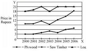
June 2010
In the following chart, the price of logs is shown in per cubic metre and that of Plywood and Saw Timber in per tones. Study the chart and answer the following questions.
(A) Saw timber
(B) Plywood
(C) Log
(D) None of the above
Answer A
- What is the maximum percentage increase in price per cubic metre of log ?
(A) 6
(B) 12
(C) 18
(D) 20
Answer D
- In which year the prices of two products increased and that of the third increased ?
(A) 2000
(B) 2002
(C) 2003
(D) 2006
Answer B
December 2009
Questions from 1 – 2 are based on the following diagram in which there are three intersecting circles. H representing The Hindu, I representing Indian Express and T representing The Times of India. A total of 50 persons were surveyed and the number in the Venn diagram indicates the number of persons reading the newspapers.
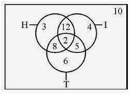
(A) 23
(B) 25
(C) 27
(D) 29
Answer C
(A) 23
(B) 25
(C) 27
(D) 48
Answer A
Explanation:
1) At least 2 : {2,3,4,……}
2) At most 2 : {0,1,2}
3) Almost 2 : {0,1}
(A) 1
(B) 2
(C) 3
(D) 4
Answer C
(A) Census of India
(B) National Sample Survey
(C) Statistical Abstracts of India
(D) National Family Health Survey
Answer C
- Which of the four data sets have more dispersion?
(A) 88 91 90 92 89 91
(B) 0 1 1 0 –1 –2
(C) 3 5 2 4 1 5
(D) 0 5 8 10 –2 –8
Answer D
June 2009
Questions 1 and 2 are based on the following venn diagram in which there are three intersecting circles representing Hindi knowing persons, English knowing persons and persons who are working as teachers. Different regions so obtained in the figure are marked as a, b, c, d, e, f and g.
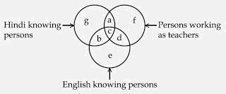
(A) g
(B) b
(C) c
(D) e
Answer C
- If you want to select persons, who do not know English and are not teachers, which of the region is to be selected?
(A) e
(B) g
(C) b
(D) a
Answer B
Study the following graph carefully and answer questions 3 to 5.

(A) 2005
(B) 2006
(C) 2004
(D) 2007
Answer B
(A) 2004
(B) 2007
(C) 2005
(D) 2006
Answer B
(A) 2004
(B) 2005
(C) 2006
(D) 2007
Answer C
December 2008
Study the following Venn diagram and answer questions nos. 1 to 3.
Three circles representing GRADUATES, CLERKS and GOVERNMENT EMPLOYEES are intersecting. The intersections are marked A, B, C, e, f, g and h. Which part best represents the statements in questions 31 to 33?

- Some Graduates are Government employees but not as Clerks.
(A) h
(B) g
(C) f
(D) e
Answer C
- Clerks who are graduates as well as government employees:
(A) e
(B) f
(C) g
(D) h
Answer D
(A) f
(B) g
(C) h
(D) e
Answer D
Study the following graph and answer questions numbered from 4 to 5:
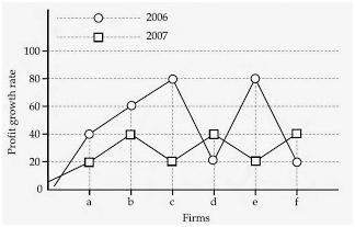
(A) ab
(B) ce
(C) cd
(D) ef
Answer B
- Which of the firms got maximum profit growth rate in the year 2007?
(A) bdf
(B) acf
(C) bed
(D) ace
Answer A
December 2007
Questions 1 to 3 are based on the following diagram in which there are three interlocking circles I, S and P, where circle I stands for Indians, circle S for Scientists and circle P for Politicians. Different regions in the figure are lettered from a to f
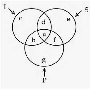
(A) f
(B) d
(C) a
(D) c
Answer A
(A) g
(B) c
(C) f
(D) a
Answer B
(A) b
(B) c
(C) a
(D) d
Answer C
December 2006
Study the following graph and answer the following questions:

(A) a
(B) b
(C) d
(D) f
Answer D
(A) a
(B) c
(C) d
(D) e
Answer A
- In the years 2000 and 2001, which of the following Companies earned maximum average percent profit?
(A) f
(B) e
(C) d
(D) b
Answer A
June 2006
The following pie chart indicates the expenditure of a country on various sports during a particular year. Study the pie chart and answer the following questions:
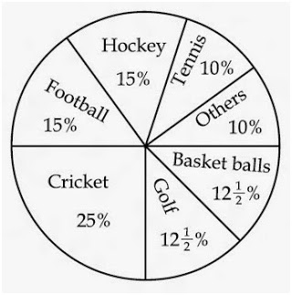
(A) 1:15
(B) 1:1
(C) 15:1
(D) 3:20
Answer B
- If the total expenditure on sports during the year was Rs. 1,20,000,00 how much was spent on basket ball?
(A) Rs. 9,50,000
(B) Rs. 10,00,000
(C) Rs. 12,00,000
(D) Rs. 15,00,000
Answer D
(A) Hockey
(B) Football
(C) Cricket
(D) Tennis
Answer C
- Out of the following country’s expenditure is the same on :
(A) Hockey and Tennis
(B) Golf and Basket ball
(C) Cricket and Football
(D) Hockey and Golf
Answer B
- If the total expenditure on sport during the year was Rs. 1,50,00,000 the expenditure on cricket and hockey together was:
(A) Rs. 60,00,000
(B) Rs. 50,00,000
(C) Rs. 37,50,000
(D) Rs. 25,00,000
Answer A
December 2005
Study the following graph carefully and answer Q.No. 1 to 5 given below it:

- In which year the value per tin was minimum?
(A) 1995
(B) 1996
(C) 1998
(D) 1999
Answer A
- What was the difference between the tins exported in 1997 and 1998?
(A) 10
(B) 1000
(C) 100000
(D) 1000000
Answer A
- What was the approximate percentage increase in export value from 1995 to 1999?
(A) 350
(B) 330.3
(C) 433.3
(D) None of these
Answer D
- What was the percentage drop in export quantity from 1995 to 1996?
(A) 75
(B) 50
(C) 25
(D) None of these
Answer C
- If in 1998, the tins were exported at the same rate per tin as that in 1997, what would be the value (in crores of rupees) of export in 1998?
(A) 400
(B) 375
(C) 352
(D) 330
Answer C
December 2004
Study the following graph and answer the questions from 1 to 3:

- In which year was the sale of‘Pep-up’the maximum?
(A) 1990
(B) 1992
(C) 1993
(D) None of the above
Answer D
- In the case of which soft drink was the average annual sale maximum during the period 1988 – 1993.
(A) Pep – up only
(B) Cool – sip only
(C) Cool – sip and Dew – drop
(D) Pep – up and Dew – drop
Answer A
(A) 5
(B) 12
(C) 14
(D) 20
Answer C
- The number of students in two classes A and B and the respective “mean” of the marks obtained by each of the class are given in the following table:
Class A Class B
Number of Students 20 80
Arithmetic Mean 10 20
The combined “mean” of the marks of the two classes will be:
(A) 18
(B) 15
(C) 10
(D) 20
Teaching Aptitude: https://goo.gl/UF2ojY
Research Aptitude: https://goo.gl/TgyqyK
ICT- Computer Aptitude :https://goo.gl/7smZNu
Higher Education: https://goo.gl/3dSkPn
If any one wants to get PDFs by Navclasses then click here: https://www.facebook.com/groups/navclasses/files/
Join on FB Group: https://www.facebook.com/groups/navclasses/
Like Fb Page: https://www.facebook.com/navclassesonline


2 responses
add me mam
Safe To Buy Viagra Online [url=https://viacialisns.com/#]order cialis online[/url] Viagra Da 25 Cialis Canadian Pharmacy Express